Our New Logo and Brand: Raising our banner for social justice
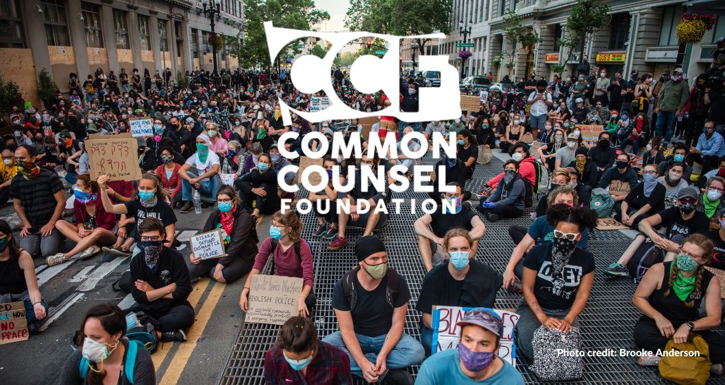
For 35 years, Common Counsel Foundation has supported social justice movements. Our new logo and brand illustrate that commitment, affirmatively raising our banner in alignment with communities and efforts organizing for justice.
Common Counsel Foundation was created to be an organizing space for donors to align with social justice organizations. It was a home for progressive philanthropy to come together, learn from community organizations about what is needed from donors, and to act together to resource social justice movements.
Over the years, our foundation continues to be aligned to the priorities of movement: sharing the power we wield, organizing resources, and following the lead of people most harmed by unjust systems and their solutions for a more democratic, equitable and liberated society.
As we took on an overhaul of our website, visual identity, and overall visual expression of our work, it was essential to reflect this unwavering alignment. As we share our new brand, logo, and materials that come from the foundation, we hope you see them as continuing that expression: Proactive and firm in our stance supporting community power and movements for social justice.
Through this visual, whether experienced as a banner raised or firmly planted, we are signaling our values, our practices, and stance with communities, and our mission to link together with others who share this orientation toward a just future.
Common Counsel Foundation has historically used the anchor color blue to signify harmony, connection, and progress. We have added a deep green as a core brand color, to bring in our connection to earth and natural systems. We have also added transparent logo varieties to signify our position is not leading, dictating or distracting, but to amplify and align with the efforts of the frontlines. Other elements and recognitions we would like to make with our brand include:
- The talented team and thoughtful design of Elefint Design anchored our redesign in the digital space of our website, determining our palette, fonts and bolder people-forward aesthetic.
- Design Action Collective guided a process that helped bring our social justice orientation in the world and in our work to life through this logo, and codifying our brand, and its elements in templates and styleguide.
- A typeface created by Vocal Type, reflecting the “I AM A MAN” signage of the Memphis Sanitation Strike of 1968, is the lead brand font on our website and across materials, VTC Martin. It is one in the family of fonts from Vocal that brings the hand-drawn styles of civil rights movements into codified typography. The Vocal Type foundry mission is to elevate designs, perspectives and stories of people of color, who have had too small a voice in the design industry.
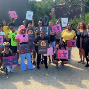
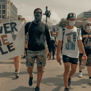
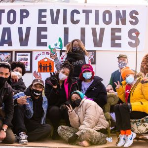
- We feature photography from nonprofit partners as much as possible to reflect our people-centered work. We worked with Brooke Anderson, Movement Photographer, to include photography of people and actions close to our headquarters in Oakland, and want to extend our gratitude for her work documenting today’s social justice movements in action.
Branding and design are abstract at times, when done well we believe can be purposeful and create intuitive signals of values and beliefs. We hope that this new brand speaks to what you know of Common Counsel Foundation, our work and partnerships, and our mission to mobilize support for social justice movements.

